Carolyn Davidson, the woman who designed the Swoosh logo
The power of Nike is a female victory
September 16th, 2020
The American brand Nike is the absolute protagonist of the sportswear industry today, and we have all seen at least once the Just do it campaigns and wore a pair of sneakers with the Swoosh. The iconic logo is in fact recognized all over the world, but not everyone knows that the famous swoosh is the son of the creative mind of a young student, Carolyn Davidson, who, with the strength of her imagination, managed to impress the power of the brand in history with a few simple lines.
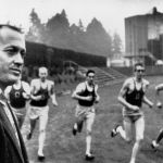
Studying at the University of Portland in 1964, Carolyn began her career in journalism, then changed her mind by enrolling to the faculty of design. In 1969 Carolyn met Phil Knight, a young professor of accounting and co-founder, together with University coach Bill Bowerman of Blue Ribbon Sports, a company that initially dealt with importing Onitsuka Tiger basketball shoes to the United States. Knight and Bowerman had the ambition to add an original line to the imported sneakers, so they needed an original logo and name.
Legend tells that one day in 1971 Knight met Carolyn outside his faculty as she was complaining of not having enough money to buy oil paints, the professor listened to everything and decided to entrust her with his project: designing a new logo for the first football and running shoes he was designing with coach Bowerman.
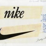
And it is the goddess of victory, Athena, in Greek "Nikè", who inspired this concept, then also giving the brand a new name. The Nike logo is a visual representation of movement and speed and the name of the logo itself, renamed "Swoosh", is an onomatopoeia that evokes the image and sound emitted by an athlete performing a sprint starting from the block, going towards the victory. Carolyn designs a dozen logos in 17.5 hours, working mostly on hand-drawn shoe designs. All this with an agreed salary of $2 an hour, earning a total of $35 for a project that at the time did not envisage the global success it then enjoyed, so much so that its client - Professor Knight - decided to keep only the least worst. Despite initial hesitation, the logo was registered on June 18, 1971.
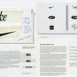
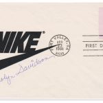
The swoosh became Nike's official logo in 1984 and Carolyn Davidson is recognized as the “motherhood” of the symbol. After the creation of the logo, Davidson continues to work for Nike mainly dealing with communication and advertising, creating posters, flyers and slogans, and remains with Nike until 1975. To seal the recognition, Knight gives her a gold ring shaped as a swoosh, with a small diamond next to the peak of the curve, which Carolyn still wears triumphantly to this day and never tires of looking, as she revealed to the media. In addition to the ring, the company gives her the certificate of ownership of the logo and a large number of shares. In 2011, the company book Swoosh: 40 Years Fly By celebrates the achievements of Nike Dept., and the first sketches of the logo and some images of the initial prototypes emerge.
How did the Swoosh evolve during the years?
49 years have passed since its origins in 1971. The logo will be half a century old next year, and we are already feeling an air of celebration. But let's see closely how, from the distant 70s, the logo has transformed until today.
1971: Carolyn Davidson
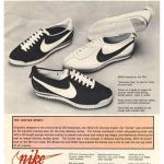
Minimalism and power. Carolyn's design captured the present and the future in a single line, creating the foundation for the brand's identity and a symbol for global sport. The first impression made to Knight turns out to be wrong, despite his initial "I don't lo, but maybe I'll like it." For the first seven years the word nike in italic lowercase Serif accompanies the swoosh, which appears as an image in the background. The colors are dark, from black to midnight blue, similar to what we see today on many contemporary models.
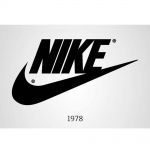
1978
The advertising agency John Brown & Partners, at the time the head of Nike advertising operations, transformed the logo with the Futura Bold font, setting all the letters in capital letters. Here the kerning technique intervenes, which increases the space between the letters creating a stronger and impacting effect at first sight. The swoosh is more geometric.
1985
The logo remains the same, but it closes in a bright red box. A bit like the Supreme Box Logo, in this version Nike begins to become popular with professional athletes and celebrities. Michael Jordan's endorsement also arrives, and the collaboration is still a symbol of sport and culture globally today. During this period Nike also launched the Just do it slogan.
1995
Finally, 15-year-old Nike has adopted its current logo, the lone swoosh, so called due to the removal of the name from the logo. The symbol that shaped the entire Nike world, in the name of movement, and not just on the playing fields.


.webp)


.webp)


